Exporting Voice API Statistics to a PDF
Overview
Have you ever wanted to gather Voice API usage data, but struggled to visualize your data while sorting through your call logs? Let's dive into a few statistical methods to help analyze the activity within your SignalWire Voice Space.
Full code example: Voice API Statistics to PDF in Python
import pandas as pd
import matplotlib.pyplot as plt
from signalwire.rest import Client as signalwire_client
from matplotlib.backends.backend_pdf import PdfPages

# Input User Authentication into Client
account= "649dc08e-3558-XXXX-XXXX-XXXXXXXXXXXX"
token= "PTb92e2a8f0f177f8f8b757b75c3fXXXXXXXXXXXXXXXXXXXXX"
space = 'SPACE.signalwire.com'
client = signalwire_client(account, token , signalwire_space_url = space)


# Declare an array that will contain the data of every parameter we are seaching for
call = []

# Append our call array with all available parameters
calls = client.calls.list()
for record in calls:
        call.append((record.start_time, record.duration, record.status, record.direction, record.from_, record.to, record.feedback, record.price, record.date_created))
df = pd.DataFrame(call, columns=('Start Time', 'Duration', 'Status', 'Direction', 'From', 'To', 'Feedback', 'Price', 'Date'))
pd.set_option('display.max_rows', None)
pd.set_option('display.max_columns', None)

# Uncomment the print command below to see the raw output of our dataframe
#print(df)


# Initialize the collection of plots that will be saved as pages in the pdf
export_pdf = PdfPages('Voice_API_Statistics.pdf')


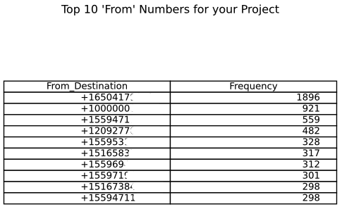
## Display your most popular incoming numbers through a data table

# Isolate the 'from' number column of our data frame and count the frequency of each unique occurance
df_from = (df['From'].value_counts()).reset_index()

# Take only the 10 most popular from destinations and add labels to our data frame
df_from = df_from[:10]
df_from.columns = ['From_Destination', 'Frequency']

# Turn data set of Most Common From Numbers into a subplot table
fig, ax =plt.subplots()
ax.axis('tight')
ax.axis('off')
the_table = ax.table(cellText=df_from.values,colLabels=df_from.columns,loc='center', )
ax.set_title("Top 10 'From' Numbers for your Project")
ax.axis("off")
# Save figure as a new page in our pdf document
export_pdf.savefig(fig, bbox_inches='tight')


## Create Pie Chart displaying the percentage of inbound and outbound calls

# Count the number of occurances of inbound and outbound within the 'direction' column
df_direction = (df['Direction'].value_counts())

#Use matplotlib to turn our data frame df_direction into a histogram
fig=plt.figure()
direction_calls_labels = ['Inbound', 'Outbound']
pie_chart=plt.pie(df_direction, autopct='%1.1f%%', labels= direction_calls_labels)
plt.title('Direction of All Calls')
# Save figure as a new page in our pdf document
export_pdf.savefig()


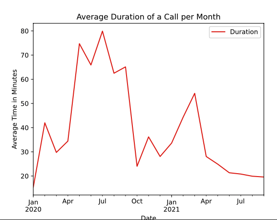
## Create a Lineplot displaying the average duration of Calls per Month

# Create a data frame that groups calls by Month and find the average of each month
grouped = df.groupby(df['Date'].dt.to_period('M')).mean()

# Use the grouped data frame to create a lineplot of mean duration per month
fig=plt.figure()
lines=grouped.plot.line(title='Average Duration of a Call per Month', color= 'red')
lines.set_ylabel("Average Time in Minutes")
# Save figure as a new page in our pdf document
export_pdf.savefig()


## Create a histogram to demonstration duration of calls

# Extract on the duration column of our data frame and create histogram
fig=plt.figure()
hist=df.hist(column='Duration', color = "green")
plt.title('Histogram of Duration of Calls for your Project')
plt.xlabel("Duration of Call (Minutes)")
plt.ylabel("Frequency")
# Save figure as a new page in our pdf document
export_pdf.savefig()

# Close the pdf object
export_pdf.close()
This snippet incorporates SignalWire's List All Calls Endpoint to gather a JSON response with all desired data. From this pulled data, this code will also walk through creating plots through matplotlib, creating data frames through pandas, and formatting appropriate data to identify potential issues.
What you need to run the code
You must have the SignalWire Python SDK installed.
Python REST API will be used with the assistance of the matplotlib.pyplot and pandas packages.
What variables change?
account - Your project ID is an alphanumeric string that tells the SignalWire SDK where to find your project. You can find this in an easily copyable format by going to your SignalWire Space and clicking the API tab on the lefthand side.
token - Your Auth Token is an alphanumeric string that helps to authenticate your HTTP requests to SignalWire. You can create this (if you haven’t already) or copy this in an easily copyable format by going to your SignalWire Space and clicking the API tab. If you have not created an API token, press the blue new button. If you already have, click "show" and copy the string.
space - Your space URL is the domain of your space, i.e. example.signalwire.com. This can also be found in an easily copyable format within the API tab in your SignalWire Space.
When calling the List all Calls API, you can filter by many different parameters such as a time, to/from numbers, status, and much more! Remember to use datetime formatting for referencing time and proper formatting for referencing specific phone numbers (‘+1XXXYYYZZZZ’)
The Code
import pandas as pd
import matplotlib.pyplot as plt
from signalwire.rest import Client as signalwire_client
from matplotlib.backends.backend_pdf import PdfPages

# Input User Authentication into Client
account= "649dc08e-3558-4efe-a598-XXXXXXXXXXXX"
token= "PTb92e2a8f0f177f8f8b757b75c3f24f0f4f1aXXXXXXXXXXXX"
space = 'SPACE.signalwire.com'
client = signalwire_client(account, token , signalwire_space_url = space)

# Initialize the collection of plots that will be saved as pages in the pdf
export_pdf = PdfPages('Voice_API_Statistics.pdf')

# Declare an array that will contain the data of every parameter we are seaching for
call = []

# Append our call array with all available parameters
calls = client.calls.list()
for record in calls:
        call.append((record.start_time, record.duration, record.status, record.direction, record.from_, record.to, record.feedback, record.price, record.date_created))
df = pd.DataFrame(call, columns=('Start Time', 'Duration', 'Status', 'Direction', 'From', 'To', 'Feedback', 'Price', 'Date'))
pd.set_option('display.max_rows', None)
pd.set_option('display.max_columns', None)

# Uncomment the print command below to see the raw output of our dataframe
#print(df)

# Lets eliminate any calls that were not answered by excluding any call without a price
answered_calls_price=[]
for record in calls:
    if str(record.price) != 'None':
        answered_calls_price.append((record.price))


## Display your most popular incoming numbers through a data table

# Isolate the 'from' number column of our data frame and count the frequency of each unique occurance
df_from = (df['From'].value_counts()).reset_index()

# Take only the 10 most popular from destinations and add labels to our data frame
df_from = df_from[:10]
df_from.columns = ['From_Destination', 'Frequency']

# Turn data set of Most Common From Numbers into a subplot table
fig, ax =plt.subplots()
ax.axis('tight')
ax.axis('off')
the_table = ax.table(cellText=df_from.values,colLabels=df_from.columns,loc='center', )
ax.set_title("Top 10 'From' Numbers for your Project")
ax.axis("off")
# Save figure as a new page in our pdf document
export_pdf.savefig(fig, bbox_inches='tight')


## Create Pie Chart displaying the percentage of inbound and outbound calls

# Count the number of occurances of inbound and outbound within the 'direction' column
df_direction = (df['Direction'].value_counts())

#Use matplotlib to turn our data frame df_direction into a histogram
fig=plt.figure()
direction_calls_labels = ['Inbound', 'Outbound']
pie_chart=plt.pie(df_direction, autopct='%1.1f%%', labels= direction_calls_labels)
plt.title('Direction of All Calls')
# Save figure as a new page in our pdf document
export_pdf.savefig()


## Create a Lineplot displaying the average duration of Calls per Month

# Create a data frame that groups calls by Month and find the average of each month
grouped = df.groupby(df['Date'].dt.to_period('M')).mean()

# Use the grouped data frame to create a lineplot of mean duration per month
fig=plt.figure()
lines=grouped.plot.line(title='Average Duration of a Call per Month', color= 'red')
lines.set_ylabel("Average Time in Minutes")
# Save figure as a new page in our pdf document
export_pdf.savefig()


## Create a histogram to demonstration duration of calls

# Extract on the duration column of our data frame and create histogram
fig=plt.figure()
hist=df.hist(column='Duration', color = "green")
plt.title('Histogram of Duration of Calls for your Project')
plt.xlabel("Duration of Call (Minutes)")
plt.ylabel("Frequency")
# Save figure as a new page in our pdf document
export_pdf.savefig()

# Close the pdf object
export_pdf.close()
Output


Comments
This snippet introduced a few different techniques to view information given by SignalWire's Compatibility APIs. We learned how to create a plot through myplotlib, how to create a data table through pandas, and lastly how to export these into a pdf format. These packages are extremely helpful and have a lot of interesting ways to display your data.